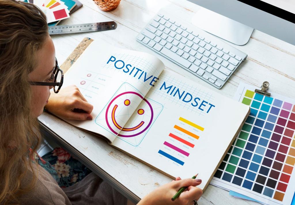
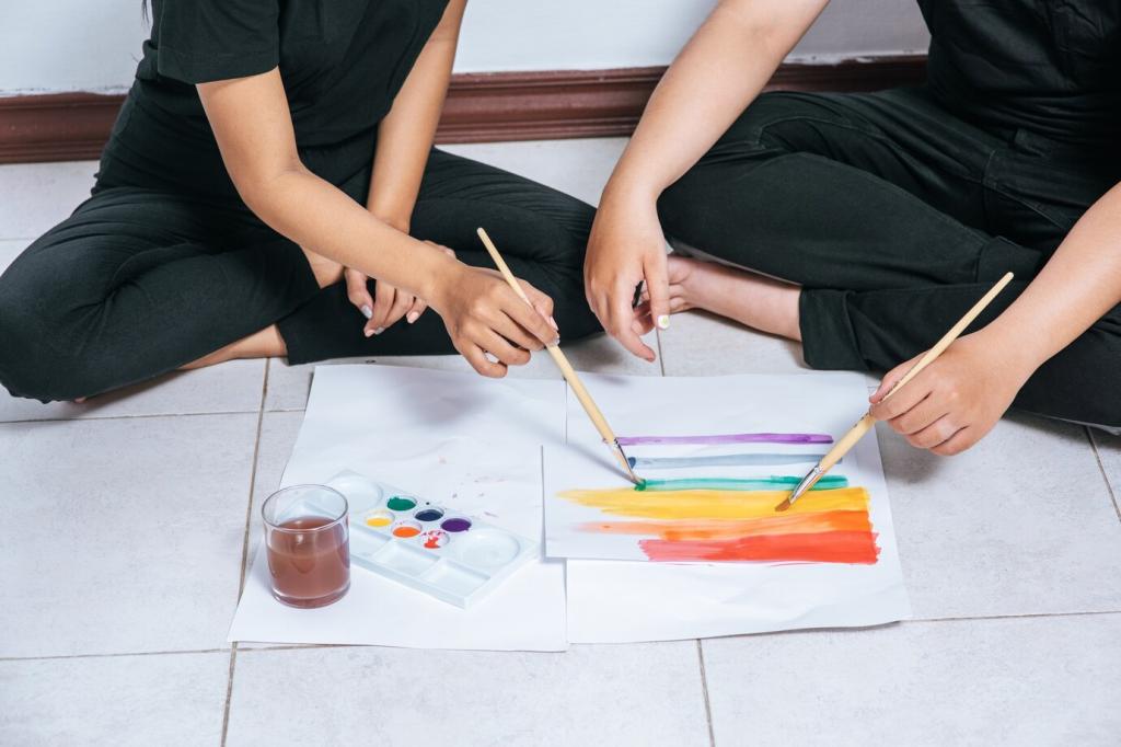
Color and Mood Mapping
Reach for yellow ochre, burnt sienna, and raw umber when you need steadiness. These pigments evoke soil and wood, lending weight without dullness. Mix them into supportive shadows beneath brighter tones, like firm ground under bare feet, and notice anxiety settle a notch lower.
Color and Mood Mapping
Ultramarine and cerulean offer oceanic space, especially in graded washes. When thoughts race, paint long horizontal blues, breathing wider with each pass. Let granulation gather like tiny pebbles on a shore. Share your favorite calming blue blend below so our community can experiment together.
Color and Mood Mapping
When you feel dim, bring in quinacridone gold, transparent pyrrole orange, or a soft coral. Use small, bright shapes like lanterns dotting a dusk sky. A little warmth goes far; notice mood lift without forcing positivity. Invite a friend to try your uplifting trio and compare notes.